Monday 29 February 2016
Life Drawing 29/02/16


Working with Robin for the first time was an enjoyable experience , where , I felt I could experiment with colour and shape more because of the energetic atmosphere that was given off in the room. I wanted to experiment more with black paper and white pencils because I feel my work has been linear in terms of black on white when it comes to drawing. I think these pieces are successful because the drawing feels as if it has some form of depth to it and also I had a lot of fun trying this medium out.
Maya Tutorials : Intro to Rigging

Todays tutorial was an introduction to rigging , although this was challenging and took a lengthy amount of time I feel as if I have a learned a lot when it comes to managing joints and how they move.
Friday 26 February 2016
Fantastic Voyage : Initial Thumbnails (1-25)

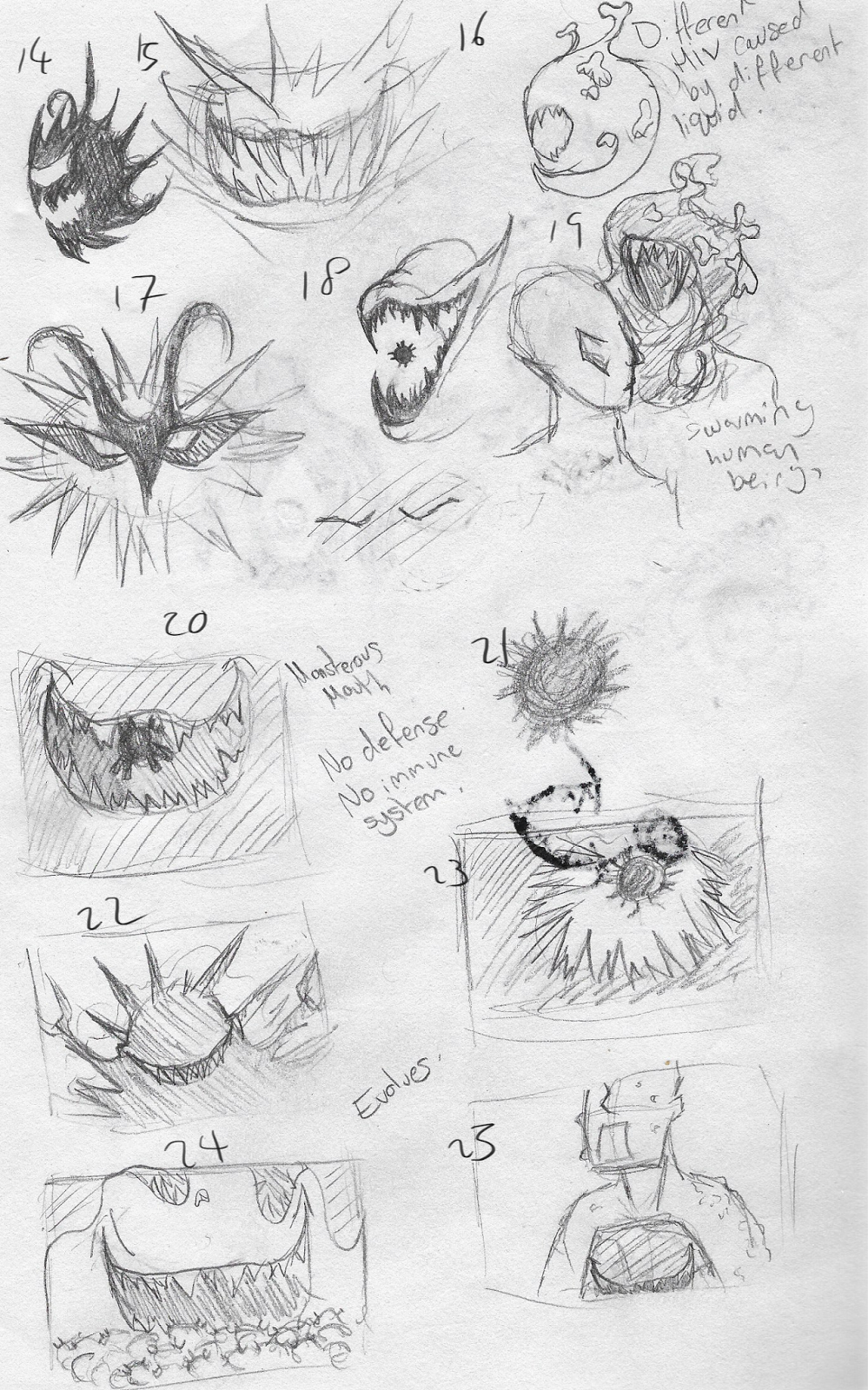
So far I have been liking and experimenting on the idea of the HIV virus being this colossal beast that much be fought and is pretty much invincible. However, I have also been experimenting with other imagery as I am still unsure of what I want the story to be or what I want to communicate. I also had the idea about the beast instead of being beaten just being chained away inside of someone since the virus can`t be cured and stays with you for the rest of your life.


Wednesday 24 February 2016
Fantastic Voyage : Initial Mindmap + Initial Sketches


So far I am unsure as to what I want my narrative to be . When listening to Dr Klappa talk yesterday I had the single scene in my head when it came to HIV and that was when the cell was dormant and it was a shadow of a figure sleeping and then when a T Cell passed by the only thing what can be seen is teeth. So far I'm going to keep sketching and see if any ideas pop into my mind.
I also started thinking of an apocalypse inside the body where the HIV cells inject their cells inside other living cells and kills them slowly over time.
Sunday 21 February 2016


Saturday 20 February 2016


Thursday 18 February 2016
Script to Screen : Statue Character Designs (Post Feedback)

After receiving feedback on my previous designs , I took the advice given to look at statues in real life where the details are less refined . After doing some more research I decided to make the hair the same colour as the skin/shadows to make the hair look blended in with the rest of the body .
When it comes to my most successful I feel it is 3B paired with the body . I think this is more successful than 3A because I feel the defining line on the eye in 3A makes the head look less statue like.
Wednesday 17 February 2016
Script to Screen : Statue Character Designs

For my final character , I took the 1950s fashion influence maps to create a housewife looking young girl. My original thoughts for her was I wanted her to look horrified and almost distorted because of her fighting ,however, after thinking about it I thought that a statue looking like that wouldn`t fit in a public space in a place which is supposed to look pretty and advertising.
When it comes to the designs I like the look of 1 and 4 with the faces and I like 6 for the body. However, any feedback for these designs will be appreciated.
Sunday 14 February 2016
Script to Screen : Private Detective Developed Designs , Property Developer + Finalizing Environment

Since gaining feedback on my previous designs , I wanted to put together the top face and top outfit designs to see how they would look as a whole design. Out of these three for the detective I think 2 is the most successful as the art style is consistent throughout .
For the Property Developer I wanted to give him a similar suit style ,however, I was struggling with his anatomy slightly from side view ,so, I wanted to see how he would look from the front view as well. This was also a struggle because his head shape is a complex shape to begin with. I will be altering the shape slightly so his body will become slightly easier to draw ,yet will still have him main defining features.

Also receiving feedback on my environment thumbnails , I was stubborn with the background of #4 so I decided to keep the background because of the business that it created. However, I saw the strengths in 3 that made it successful , where the contrast was high and the lighting made the scene almost menacing. That being said , I combined the house and level settings used in 3 and went along with the background I thought was the most successful.
Any feedback to improve this thumbnail will be appreciated.
Saturday 13 February 2016
Script to Screen : Street Thumbnails

These thumbnails I wanted to experiment with composition , I know my camera angle will be at an angle similar to thumbnail 1 ,however, I had trouble experimenting with different environments without them looking the same ,so, for the concept art I chose to try the composition shown in 2 & 3. My favorite and most accurate of the 3 is 3 since the asymmetrical look gives accuracy to the scene where one side is a calm neighborhood and the other side is a scene of destruction with destroyed houses.
Script to Screen : Demolition Site Exterior Thumbnails + Property Developer Facial Shots

Sticking with my Film Noir theme , I struggled with these thumbnails as I wanted the scene to be cluttered and busy. With my first two I struggled to get that sense ,so, I gradually added more machines and cluttered the background. By my final thumbnail I decided to add people to the background which I hadn`t thought about previously. Currently I`m finding difficulty to decide between 3 & 4 ,plus, any feedback would be appreciated :).

For my facial shots I was originally going along the lines of the mafia and making him look like a suave behind the scenes man ,however, the more I went along these lines I felt as if he should have a more intimidating look about him ,so, I took inspiration from Sykes from Oliver & Company to make him seem more of a businessman yet who still seemed cunning and brute-ish.
Wednesday 10 February 2016
Digital Painting Exercises 10/02/16


Getting back into digital painting was both exciting and a struggle due to not doing master studies since the beginning of the year. I feel as if these exercises have helped keep alive my love of digital painting and although these are not as good (in my opinion) compared to my master studies at the beginning of the year , I feel as if I branched out when it came to brushes and painting techniques.
Tuesday 9 February 2016


Friday 5 February 2016
Wednesday 3 February 2016
Script to Screen OGR #2 TBU
This OGR will be updated at a later date with all the work included. Due to illness not all the work is here and has been negotiated to be uploaded at a later date when I`m well enough to complete it.
Character Design Workshop : Composition Exercises


Todays exercise with Justin focused on compositon and the rule of thirds. We were asked to work with a triangle , square and circle to generate different situations by manipulating the camera angle. I feel this technique worked really well since I didn`t have to focus on the detail of characters. Focusing on shapes instead let me focus on the scene more and not stress over if the characters looked right or not. Overall , I feel this exercise helped me a lot and I feel my experiments were successful in terms of creating dynamic scenes.
Soundscape : Image 3 Composition
Starting work on our soundscapes today was an interesting experience , I feel as if I've learned a great deal over the past few weeks and feel as if I've been able to create a successful soundscape with only a few sounds. For future edits , I was recommended to try panning the breathing noises since I felt the eery atmosphere in the breathing had disappeared when being played through speakers.
Tuesday 2 February 2016
Script to Screen : Private Detective Character Designs

Keeping to the Film Noir style , I kept the colour scheme strictly black and white. I wanted to keep the style of the detective suave and put together yet looks as if he is about to dive into action. I took influence from the images in my influence map with the layered clothes , a trenchcoat and fedora. And took heavy influence from 1950s film (the time of Film Noir) and the trend of slicked back hair and quite clean appearance. My favorites out of these were 3 for the outit and art style and for the face I likes 5,7 and 8.
@Phil Script to Screen Draft Script 2 (Dialogue)
Taking the advice from my previous draft , I kept the dialogue more short and snappy to create more tension. In this draft I left out the camera shots and other features which I will be keeping the same as in my first draft.
However, one thing I am unsure of is the ending line from the Property Developer. I haven`t included it in this draft but I`m struggling to think of a closing line when the sculpture decends. I know I want the closing line to pack a punch and make it seem as if theres a game between him and the detective , similar to cat and mouse. If anyone has any suggestions that`d be great.
However, one thing I am unsure of is the ending line from the Property Developer. I haven`t included it in this draft but I`m struggling to think of a closing line when the sculpture decends. I know I want the closing line to pack a punch and make it seem as if theres a game between him and the detective , similar to cat and mouse. If anyone has any suggestions that`d be great.
Monday 1 February 2016
Subscribe to:
Posts (Atom)